What happened to Tate Britain? How did it become the kindly killer of everything that was once exciting and dangerous in British art? In the 1990s, this neoclassical building, then just the Tate, was a stage for the new, the home of sensations, a place where provocative art punched you in the face. That era is currently memorialised in the gaping Duveen space in the middle of the museum, where Vong Phaophanit’s eerily beautiful Neon Rice Field, a long dreamy array of rice divided by strips of pink light, points the way to Rachel Whiteread’s towering cast of the underneath of a double staircase. Whiteread and Phaophanit were both nominated for the 1993 Turner prize: the first Turner that had to be seen, in the same way that back then the latest Martin Amis had to be read.
But today’s Tate Britain is where art goes to sleep. That’s largely because it is committed to a worthy view of art. It isn’t the ideals I object to but rather the stultifying fact that when you insist on art’s moral value, you make it predictable and dull. To try to pretend it still matters, Tate Britain ostentatiously “rehangs” its collection every few years. Not a single such rehang has ever made a convincing, coherent case for British art – and the latest is no exception. Maybe it doesn’t want to promote British art, for it seems to disapprove of much of it.
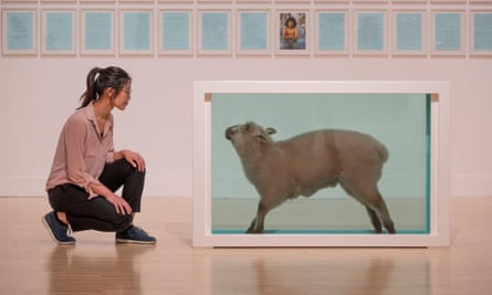
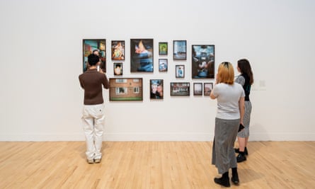
All that excitement about Young British Art back in the 90s is scornfully shrunk into a sin bin called End of a Century, with one work each by the likes of Gillian Wearing, Damien Hirst and Sarah Lucas. Not only are these living artists reduced to dry little eyebites, they’re relegated to the past, along with Lucian Freud. It’s a miserable room – but the one that follows is worse. Here, a painting whose sloppy futility could have been slapped together as easily 40 years ago; there, a photograph of the sea by Wolfgang Tillmans; here, a chunk of heavy machinery; there, a few more so-so paintings botched together to show the current condition of art and the country. The pompous room title, The State We’re In, promises deep sociopolitical diagnosis. Instead, it’s just a scrappy selection of disconnected stuff. Or perhaps they’re saying that, as a nation, we’re as vacuous, timid and fundamentally dull as this display.

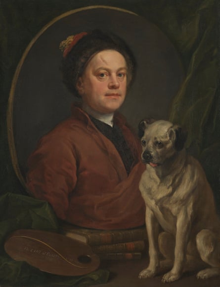
The novelty of this rehang is to impose a veneer of current concerns with slavery, empire, sexual identity and gender on to displays that are otherwise quite familiar. The results are glib, patronising, belittling. What, for instance, has Tate Britain got against William Hogarth’s pungent 18th-century satires that it has to “correct” them with a contemporary piece by Pablo Bronstein celebrating Georgian London’s Molly houses? I’ve been fascinated by these subversive social spaces ever since reading Alan Bray’s pioneering 1982 book Homosexuality in Renaissance England, but I don’t see how Bronstein’s cutely stylish work helps us look at Hogarth. It feels as if the scabrous painter is being called out for his failure to set his scenes of sexual dalliance and social corruption in Molly houses rather than brothels and asylums. But if you look carefully at Hogarth’s A Scene from the Beggar’s Opera you might spot a lesbian encounter. Give 18th-century satire a chance.

Another room chastises baroque painters: how dare William Dobson portray the toff Endymion Porter when he should have been painting the Levellers who tried to overturn the social order during the English civil war? Ranter pamphlets and other radical prints fill a mural by contemporary artist Nils Norman, to put the likes of Dobson, a young British genius who died in his 30s, in their place. A sculpture of two suitcases by Mona Hatoum connects migration today with continental European painters who worked in Tudor Britain. But what exactly is the connection? And how should it change the way I see Marcus Gheeraerts II’s 1594 portrait of Captain Thomas Lee flaunting his fine bare legs?
The problem with these “interventions” is not just that they are historically naive, but that they fundamentally misunderstand the way we use museums. What does Tate Britain think – that we’ll read every text, follow every argument, see every painting and even British history itself through the curators’ eyes? When you explore a gallery, you make your own connections, think your own thoughts. One work will draw you, another won’t. And it probably won’t be for the reasons the curators have hung it.
I was drawn to William Hodges’s 1782 painting Tomb and Distant View of Rajmahal Hills and to Richard Wilson’s 1774 Llyn-y-Cau, Cader Idris because they’re both light-filled visions of empty space, great sublime voids of landscapes. But I don’t think you can draw any simple political message from the way Hodges paints India any more than Wilson can be modernised into a Welsh nationalist. In fact, the social history is larded on so much, with so many boxes to tick, that it all becomes too much to take in and you have no choice but to enjoy the art for its own sake. Is that big painting of a battle by Philip James de Loutherbourg nationalist, or anti-war, or what? I dunno, but the clouds lit up by cannonfire look great.

It would be much more effective to dedicate rooms to specific historical themes. A proper display on slavery would be truly worthwhile. Instead, it is one more theme to conjure with, alongside rural poverty, the Industrial Revolution and all the other history the curators can remember. Here’s a Gainsborough portrait of the slave-owning Baillie family, while Emma Soyer’s 1831 painting Two Children With a Book is a sensitive portrayal of Black people clearly intended as emancipatory. Next to it is a portrait by Thomas Lawrence of a seated rich white guy, so let’s read his crimes on the placard – but it turns out he was an abolitionist! A goody, then? It’s all a bit superficial and pointless, a kind of historical titillation.
You wouldn’t want to be judged a baddy in this highly moralising account. Gilbert and George only get one small early video into the displays, while their outrageous pictures of skinheads and sordidness have been buried in the Tate stores. The wicked Francis Bacon’s great Triptych August 1972 is hung in a room of Henry Moores, as if to crush it under bronze. David Hockney and Frank Auerbach get bit parts, while those who supposedly played a more radical role are given their own rooms.
One such space announces that it “celebrates Annie Swynnerton’s trailblazing work as a painter and campaigner for women’s rights”. Her portrait of Count Zubov from 1908-9 is kind of catchy, like a music hall tune, but “trailblazing” this and her other paintings are not. Why is this sentimental portraitist given nine works in the displays while Bridget Riley only gets one?
Sorry Bridget, you should have been a suffragette if you wanted to be taken seriously.


 English (US)